之前公司是用flash做的这个网站,现在因为访问速度过慢或者别的原因,由我来用html5重新写过,排版布局和之前的都是一样的。
网页总体需要实现以下功能:
- 背景图片轮播
- 导航条动画效果
- 文字动画的实现
- 设计图片的展示效果(不知道怎么写,其实我还没弄明白它的实现原理,差不多就是图片的无缝滚动吧)
我主要是负责前端布局及交互效果,后台由php实现。现在总结一下本次工作get到的知识,高手可以指点一下我这个菜鸟。
背景图片轮播
背景图片轮播html代码:
1
2
3
4
5
6
7
8
<!--背景切换-->
<div class="slide">
<ul>
<li style="background-image:url(images/home/bg1.jpg) "></li>
<li style="background-image:url(images/home/bg2.jpg) "></li>
<li style="background-image:url(images/home/bg3.jpg) "></li>
</ul>
</div>
实现轮播的js代码:
1 | (function($){ |
最后在页面内调用:1
2
3
4
5<script>
$(document).ready(function(){
$(".slide").fadeImage();
})
</script>
运行效果:
下面我该用setInterval实现:1
2
3
4
5
6
7
8
9
10
11
12
13
14
15
16
17
18
19
20
21
22
23
24
25
26
27
28
29
30
31
32
33$.fn.fadeImage=function(){
var opt= {
time:1000,//图片切换时间间隔
fade:1000
};
var t=parseInt(opt.time),
f=parseInt(opt.fade),
obj=$(this).find("ul li"),
i= 0,
l=obj.length;
//初始化图片
obj.hide().eq(0).css("z-index","2").fadeIn(f);
// console.log(l);
function show(i){
obj.eq(i).css("z-index","2").fadeIn(f).siblings().css("z-index","1").fadeOut(f);
}
function play(){
i++;
if(i<l){
show(i);
}else{
i=-1;
}
}
setInterval(function(){
play();
},t+f);
};
$(document).ready(function(){
$(".slide").fadeImage();
})
SetInterval为自动重复,setTimeout不会重复。也就是说setTimeOut既定的时间间隔后只执行一次。
导航动画的实现
1
2
3
4
5
6
7
8
9
10
11
12
13
14
15
16
17
18
19
20
21
22
23
24
25
26
27
28
29
30<div class="nav">
<div class="nav-list">
<div class="en"><a href="proeile.html">PROEILE</a></div>
<div class="ch"><a href="proeile.html">诠释</a></div>
</div>
<div class="nav-list">
<div class="en"><a href="services.html">SERVICES</a></div>
<div class="ch"><a href="services.html">服务范畴</a></div>
</div>
<div class="nav-list">
<div class="en"><a href="projects.html">PROJECTS</a></div>
<div class="ch"><a href="projects.html">主要项目</a></div>
</div>
<div class="nav-list">
<div class="en"><a href="cooperation.html">COMPANY</a></div>
<div class="ch"><a href="cooperation.html">合作机构</a></div>
</div>
<div class="nav-list">
<div class="en"><a href="news.html">NEWS</a></div>
<div class="ch"><a href="news.html">公司动态</a></div>
</div>
<div class="nav-list">
<div class="en"><a href="join-us.html">JIONS US</a></div>
<div class="ch"><a href="join-us.html">人才招贤</a></div>
</div>
<div class="nav-list">
<div class="en"><a href="contact.html">CONTACT</a></div>
<div class="ch"><a href="contact.html">联系</a></div>
</div>
</div>
另一种实现方法,纯css实现:1
2
3
4
5
6
7
8
9
10
11
12
13
14
15
16
17
18
19
20
21
22
23
24
25
26
27
28
29
30
31
32
33
34
35
36
37
38
39
40
41
42
43
44
45
46
47
48
49
50
51
52
53
54
55
56.nav{
position: absolute;
/*width: 600px;*/
text-align: center;
height: 40px;
left: 30%;
}
.nav-list {
width: 100px;
height: 40px;
position: relative;
font-family: "Microsoft YaHei", "微软雅黑", Georgia, Serif;
font-size: 14px;
color: #fff;
overflow: hidden;
float: left;
}
.nav-list div {
width: 100px;
height: 40px;
line-height: 50px;
position: absolute;
text-align: center;
-webkit-transition: all 0.3s ease-in-out;
-moz-transition: all 0.3s ease-in-out;
-o-transition: all 0.3s ease-in-out;
transition: all 0.3s ease-in-out;
}
.nav-list .en {
top: 0;
left: 0;
z-index: 1;
color: #FFF;
}
.nav-list:hover .en {
top: -40px;
left: 0;
}
.nav-list .en a {
color: #FFF;
text-decoration: none;
}
.nav-list .ch {
bottom: -40px;
left: 0;
z-index: 2;
color: #FFF;
}
.nav-list:hover .ch {
bottom: 0;
left: 0;
}
.nav-list .ch a {
color: #FFF;
text-decoration: none;
}
文字动画的实现
文字动画我用到了css3的animation,就拿主页的动画做例子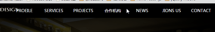
1
2
3
4
5
6
7
8
9
10
11
<div class="content">
<ul>
<li><a href="proeile.html">诠释<span>PROEILE</span></a></li>
<li><a href="services.html">服务范畴<span>SERVICES</span></a></li>
<li><a href="projects.html">主要项目<span>PROJECTS</span></a></li>
<li><a href="cooperation.html">合作机构<span>COOPERATION AGENCIES</span></a></li>
<li><a href="news.html">公司动态<span>COMPANY NEWS</span></a></li>
<li><a href="join-us.html">人才招贤<span>PERSONNEL RECRUITMENT</span></a></li>
<li><a href="contact.html">联系<span>CONTACT</span></a></li>
</ul>
</div>
1 | //css样式 |
其实我觉得我现在这个实现方法很差劲,因为不利于后台添加新的内容。试着用js代码来实现,效果还不错。1
2
3
4
5
6
7
8
9
10
11
12
13
14
15
16
17
18
19
20
21
22
23
24
25
26
27
28
29
30
31
32
33$.fn.txtSlideUp=function(){
var obj=$(this).find("ul li"),
l=obj.length,
count= 0,
i= 0,
newClass="slideUp"+(count++),
time = 1;
$("<style>" +
"."+newClass+"{-webkit-animation:txt-up 1.5s ease "+time+"s both;}" +
"</style>").appendTo("head");
obj.eq(0).addClass(newClass);
function play(){
i++;
newClass="slideUp"+(count++);
time += 0.5;
$("<style>" +
"."+newClass+"{-webkit-animation:txt-up 1.5s ease "+time+"s both;}" +
"</style>").appendTo("head");
if(i<l){
obj.eq(i).addClass(newClass);
}else{
clearInterval(set1);
}
}
var set1=setInterval(function(){
play();
},0);
};
$(document).ready(function(){
$(".content").txtSlideUp();
});
哈哈,好高兴的噢,菜鸟,加油!!!
还有另一个文字点击效果:
这个实现起来其实也很简单,只用一句代码就可以搞定了1
2
3
4
5
6
7
8
9
10
11
12
13
14
15
16
17
18
19
20
21
22
23
24
25
26
27
28
29
30
31
32
33
34
35<div class="menu-list">
<div class="main main_an1">酒店<span>HOTEL</span></div>
<div class="sub_list">
<a href="showPic.html">佛山华美达酒店</a>
<a href="showPic.html">海南龙泉大酒店</a>
<a href="showPic.html">新乡和颐鑫地酒店</a>
<a href="showPic.html">柳州宾馆</a>
</div>
<div class="main main_an2">餐饮<span>RESTAURANT</span></div>
<div class="sub_list">
<a href="showPic.html">广州酒家旧机场店</a>
<a href="showPic.html">广州酒家天极品越华路店</a>
<a href="showPic.html">广州酒家天极品花城店</a>
<a href="showPic.html">潮珍苑酒家</a>
<a href="showPic.html">广州鹅潭一号</a>
<a href="showPic.html">本厨椰子鸡汤</a>
<a href="showPic.html">中惠兰堡餐厅</a>
<a href="showPic.html">中惠兰堡养生馆</a>
</div>
<div class="main main_an3">地产<span>ESTATE</span></div>
<div class="sub_list">
<a href="showPic.html">中惠璧珑湾</a>
<a href="showPic.html">虎门国际公馆</a>
<a href="showPic.html">粤海丽江花园</a>
</div>
</div>
<script>
$(document).ready(function(){
$(".main").click(function()
{
$(this).next("div.sub_list").slideToggle(300).siblings("div.sub_list").slideUp("slow");
});
});
</script>
next()方法在jquery中是用来遍历节点的,取得每个匹配的元素的后一个同辈的元素集合,只有紧邻的同辈元素才会被匹配到。
siblings()方法是查找每个匹配元素的所有同胞元素。